HalsteadK KIT
Kevns is tech
Vol. 01 — Fall 2026 — Chicago

Type a task (contrast, brief, carousel) or a name.

    ↑↓ to move↵ to openEsc to close
    Portfolio ↗

    06 Case Studies

    THE WORK AND THE WHY.

    One fictional client, taken apart from brief to press. Then the rules and a builder for writing up your own work.

    • Fictional client, labeled
    • 10 stages
    • Case study builder
    THE CASE / HALFMOON BAKERY

    A bakery that opened too late.

    Fictional client. Halfmoon Bakery, its neighborhood, its hours and every number here are invented to show the structure of a case study. Nothing was produced and no results are claimed.

    1. 01The brief
    2. 02What we found
    3. 03The idea
    4. 04Three routes
    5. 05The mark
    6. 06The system
    7. 07Applications
    8. 08Production
    9. 09Measuring it
    10. 10What I’d change
    01

    The brief.

    A good neighborhood bakery nobody knew about. The ovens came on at 4:30 a.m., but most of the neighborhood walked past on the way to the train.

    Audience
    Early commuters and night-shift workers within a few blocks of one train platform.
    Ask
    “A logo and some signs.”
    Budget
    Small. One-color printing wherever possible.
    Never
    Rustic clichés, chalkboard script, wheat-stalk logos.

    First decision: question the ask. A logo wouldn’t fix a bakery people didn’t notice. Find out why they didn’t, then design.

    See the full brand brief, filled in for Halfmoon →

    02

    What we found.

    Illustrative hours chart: night shifts end around 6 a.m., but before the change nothing nearby, including Halfmoon, opened its door until 74A6A8A10ANOON2P4P6P8P10PTHE GAPNight shift endsHalfmoon ovens onHalfmoon door (before)Halfmoon door (proposed)Coffee chainDiner
    Illustrative research: who is open when, on one block.
    • The bread was ready at 6. The door opened at 7.
    • Night shifts end around 6. Those workers walk past the shop to the platform.
    • Nothing nearby opened before 7. That hour belonged to nobody.

    Decision: recommend opening the door at 6 before designing anything. The best idea in this project isn’t visual. The design’s job is to tell people about it.

    03

    The idea.

    Sell the hour, not the bread.

    Every bakery says fresh. Only one is open at 6. The hour is the difference, so the hour becomes the brand: the time on every piece, the reason to stop, the thing regulars call it.

    Test it: can the idea be said in one sentence, and does it rule things out? It rules out wheat, flour clouds and the word “artisan.” Good.

    04

    Three routes.

    Three routes side by side: A Clockwork, a clock-face mark with 6:00 a.m. as the headline (chosen); B Night Shift, moon phases and a serif script; C Plain Bread, an all-type sign6:00 A.M.BREAD IS OUT. TRAIN IS 9 MIN.HalfmoonFOR THE NIGHT SHIFTHALFMOONBAKERY.Bread. Coffee. Pastry.Open daily from 6 a.m.Fresh every morning.A / CLOCKWORK — CHOSENB / NIGHT SHIFTC / PLAIN BREAD
    Three directions, shown at the same fidelity so the choice is about the idea.

    A / Clockwork

    Clock-face mark, time as the headline. Carries the idea directly and works in one color.

    Chosen

    B / Night Shift

    Moon phases and a serif. Lovely, but it says “late night,” and the shop closes at 2 p.m.

    Killed: wrong hour

    C / Plain Bread

    All type, all facts. Honest and cheap, but it looks like every other sign on the block.

    Killed: invisible

    Why show the losers: the routes you killed explain the one you kept. Show them at equal polish, or the choice looks rigged.

    05

    The mark.

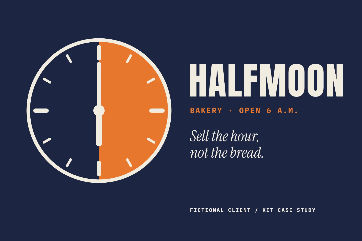
    Halfmoon mark: a clock face split into a half moon, hands at six o’clock
    At 6:00 the hands line up and split the face into a half moon.

    The mark is a clock stopped at six. At that hour the hands form one vertical line, which splits the face into a half moon. The name and the hour turn out to be the same picture.

    Decision: keep the hands at 6:00 everywhere. No other time, no animated hands spinning on the website. The mark only ever says one thing.

    Halfmoon horizontal lockup: mark plus HALFMOON wordmark and the line Bakery, open 6 a.m., every dayHALFMOONBAKERY · OPEN 6 A.M. · EVERY DAY
    Horizontal lockup.
    The mark tested at 96, 48, 24 and 16 pixels; below 24 pixels a simplified version drops the tick marks96 PX48 PX24 PXSIMPLE16 PXSIMPLEUnder 24 px the ticksand minute hand drop out.The half moon and the 6 o’clockhand still read at favicon size.
    Small-size test. The simplified version is a separate file, not a scaled-down one.
    06

    The system.

    Color

    • Night blueThe field. Most surfaces.
    • Crust orangeThe only accent. The time, and the moon.
    • FlourType on night blue; paper.

    Halfmoon’s colors belong to Halfmoon. KIT stays pink, blue and yellow; the client palette only appears inside these frames.

    Type

    6:00 A.M.

    Condensed sans for times and headlines (shown in Anton).

    Bread’s out. Your train’s in nine.

    A readable serif for menus and lines (shown in Instrument Serif).

    Voice

    • Say “Bread’s out.”
    • Say “Open at 6. Every day.”
    • Never “Artisanal goodness, baked with love.”
    • Never exclamation points. It’s 6 a.m.

    Rule that holds it together: every piece shows the time. If a layout has no time on it, it isn’t Halfmoon yet.

    07

    Applications.

    Platform poster: the mark over a huge 6:00, with A.M. Bread’s out. Your train’s in nine.6:00A.M. BREAD’S OUT.YOUR TRAIN’S IN NINE.HALFMOON BAKERYOne block south of the platform24 × 36 in
    Platform poster, 24 × 36 in. Placed one block before the station, where people still have time to turn.
    Window decal on glass: a cream circle with the mark and the words Open at 6, every day, curving over the topOPEN AT 6 · EVERY DAYSECOND-SURFACE VINYL, INSIDE THE GLASS · 18 IN DIA.
    Window decal. The one piece people see at 6 a.m. in the dark, so it’s the lightest thing on the street.
    Paper bag printed in one color: the mark, with the moon half as a 70 percent tint, over HALFMOON and Still warm at 6 a.m.HALFMOONSTILL WARM AT 6 A.M.1 COLOR: NIGHT BLUE + A 70% TINT
    Paper bag. One color on stock white bags: the cheapest run, and still unmistakable.
    Three vertical story frames counting 5:58, 5:59, then 6:00 with Bread is out and the mark5:58STILL DARK.FRAME 1 / 35:59OVENS OPEN.FRAME 2 / 36:00BREAD IS OUT.FRAME 3 / 3
    Three-frame story. A countdown that only pays off at 6:00.

    Decision: placement over volume. Two posters in the right spot beat twelve around the neighborhood.

    08

    Production.

    Keyline for a 3-inch round bag-closure label: art bleeds past the black trim circle, with a dashed blue safe circle inside3 IN DIE-CUT LABEL · TRIM BLACK · BLEED PINK · SAFE BLUE
    Keyline for the 3 in bag-closure label.
    • Poster: 4/0 on 100 lb gloss text, 0.125 in bleed, 40 copies. Hard proof, because the night blue goes muddy if it isn’t checked.
    • Bags: 1/0 in night blue on stock white bags. The moon half is a 70% tint, so it needs no second ink.
    • Labels: 3 in round, die-cut, full bleed, kept inside the safe circle.
    • Decal: printed in reverse on clear vinyl and applied inside the glass, so it survives the window washer.

    Why it’s in the case: production choices are design choices. The one-color bag is the difference between a budget that works and one that doesn’t.
    Open the poster spec in Production →

    09

    Measuring it.

    What we’d track, agreed with the client before launch:

    • Sales between 6 and 7 a.m., the hour that didn’t exist before.
    • New faces in the first month, from the counter staff’s own tally.
    • What people call it. The brief’s real goal: regulars calling it “the 6 a.m. place.”

    Results: none claimed. Halfmoon is fictional. In a real case, this is where verified numbers go, and only the ones the client confirmed in writing.

    10

    What I’d change.

    • Test the hour before the logo. A week of opening at 6 with a paper sign would have proved the idea for the price of tape.
    • Design for the dark first. The decal was drawn in daylight. At 6 a.m. in February, contrast is the whole job.
    • Plan the closing hour too. The system says when Halfmoon opens and goes quiet about when it closes.
    STATUS LABELS

    Say what it is.

    Put one label on every project, at the top. It costs nothing and saves the awkward question in the interview.

    Live

    Made for a real client and published or printed. Results only if the client confirmed them.

    Concept

    Made for a real brand or pitch but never produced. Say so.

    Spec

    Unsolicited work for a real brand, made on your own time. Never implies the brand approved it.

    Internal

    Made for your own studio, site or tools. Like this site.

    Fictional

    An invented client used to show process. Like Halfmoon, below.

    WRITING RULES

    Six rules for writing it up.

    1. 01

      Show decisions, not deliverables.

      Ten finished pieces say you can produce. One “we chose this because” says you can think.

    2. 02

      One image per decision.

      If an image doesn’t prove a choice, it’s decoration. Cut it or caption it.

    3. 03

      Results are verified or absent.

      Only numbers the client confirmed in writing. “No results claimed” is a perfectly good sentence.

    4. 04

      Label the status.

      Live, concept, spec, internal or fictional. Readers find out anyway; tell them first.

    5. 05

      Credit everyone.

      Photographers, writers, developers, the client team. And clear the images you show.

    6. 06

      End with what you’d change.

      It reads as experience, not weakness.

    CASE STUDY BUILDER

    Write yours.

    Answer the questions and get a first draft in the same order as the Halfmoon case. Leave results blank unless the client confirmed them.

    Open file ↗