01Type
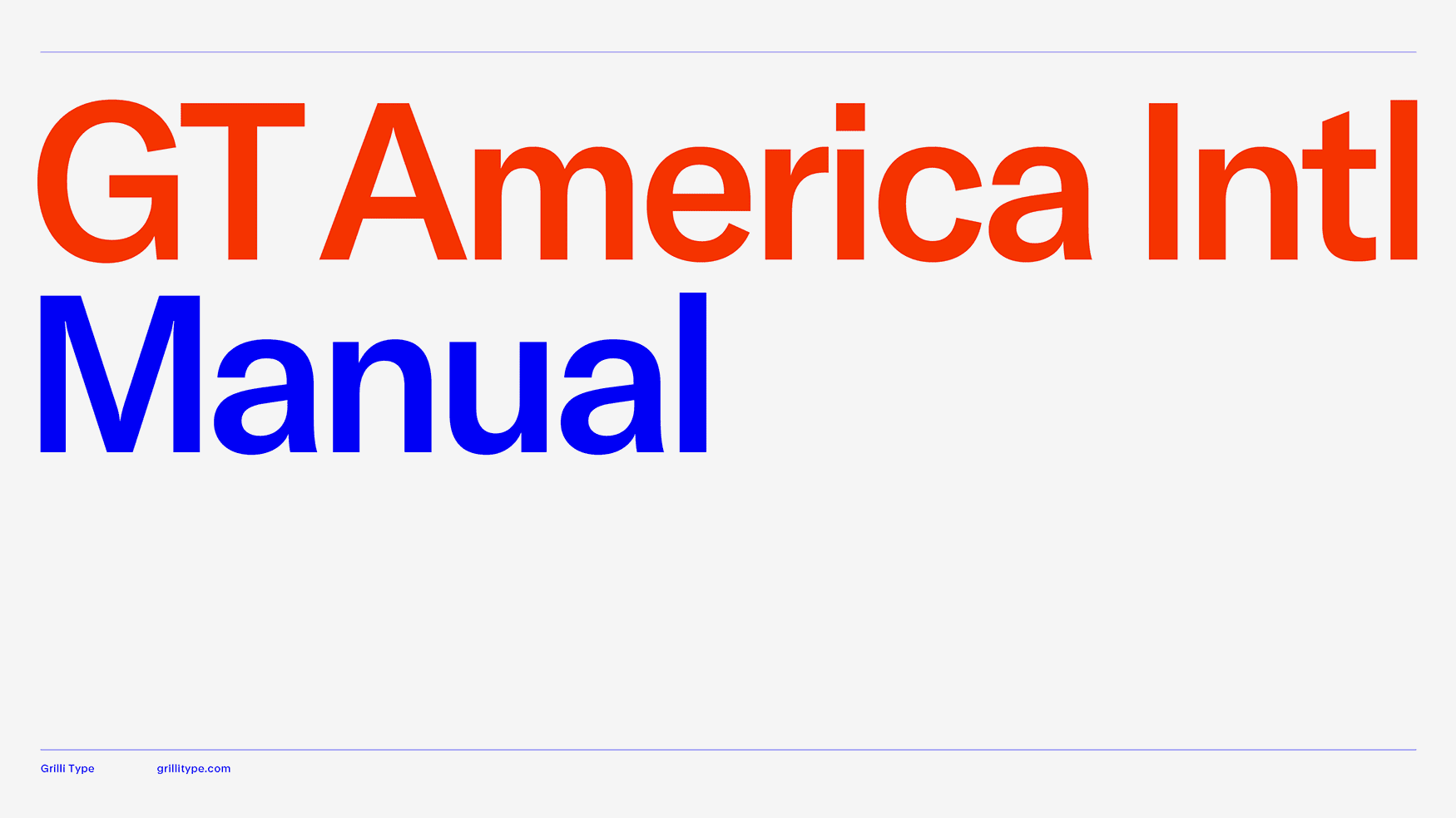
GT America
A flexible starting point for identities, navigation, and editorial systems. Build hierarchy with weight and width before adding another family.
Explore GT AmericaA working field guide to choosing type, building hierarchy, and making words worth looking at.
Illustrative system-font studies. Tiny decisions. Very loud consequences.
Choose for the job, the language, and the medium. These are editorial recommendations, not a trend ranking. Follow the source links to test the actual fonts.
A flexible starting point for identities, navigation, and editorial systems. Build hierarchy with weight and width before adding another family.
Explore GT America
A compact, direct voice for cultural identities and dense editorial layouts. Test counters and punctuation at the smallest intended size.
Explore ABC Diatype
For contemporary brands that need a clear backbone. Give it a distinctive grid and a deliberate scale so the result has its own voice.
Explore PP Neue Montreal
Soft, sculptural contrast for titles and introductions. Let it carry the mood; give long text a family designed for reading.
Explore Canela
A loud choice for campaigns, posters, and short headlines. Use compression as a compositional tool; keep supporting text calm.
Explore Druk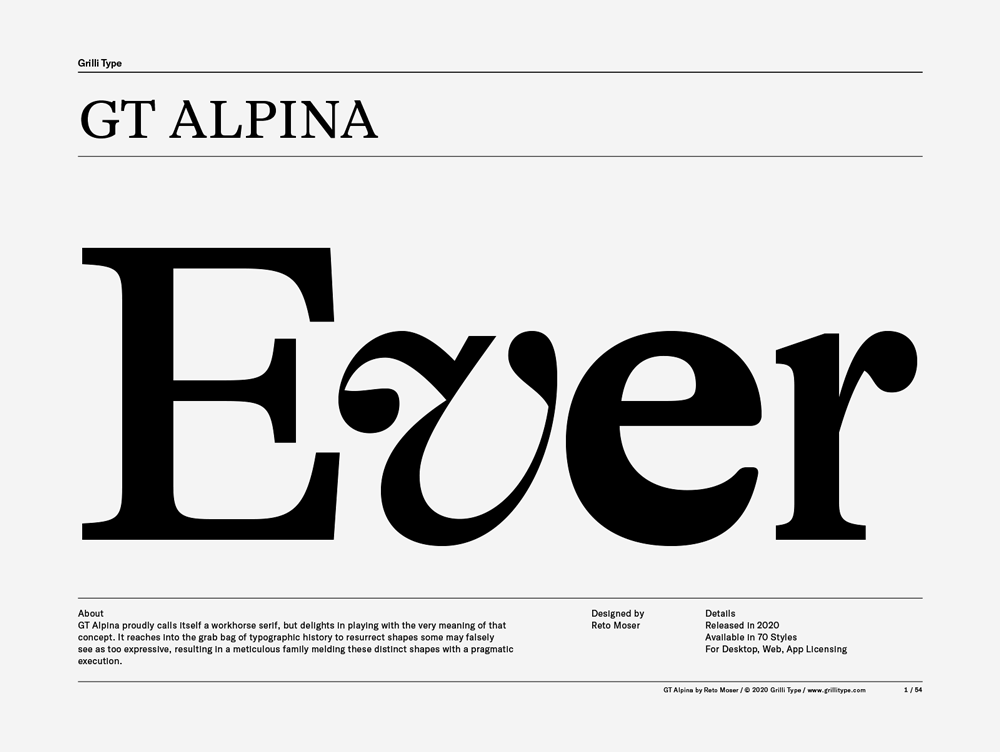
A characterful direction for essays, cultural projects, and identities with a literary voice. Compare text and display styles at their intended sizes.
Explore GT AlpinaAn approachable starting point for contemporary digital work. Pair with a warmer serif when the system needs a little tension.
Explore SatoshiA straightforward option for supporting text, captions, and everyday interfaces. Establish a small, repeatable set of weights.
Explore General SansA dependable interface candidate. Check numbers, labels, and multilingual content; use deliberate art direction to avoid a default-looking page.
Explore InterA useful candidate for articles and documentation. Try optical sizing and real italics before locking the text system.
Explore Source Serif 4For reading-focused pages with a quiet editorial tone. Test the same paragraph across optical sizes and screen widths.
Explore NewsreaderFor code, data labels, and small moments of technical texture. Keep extended prose in a proportional family.
Explore IBM Plex MonoNames above are set in KIT’s interface font, not specimens of the recommended families. Compare real paragraphs, italics, numerals, and language coverage on the linked foundry pages.
Read specimens, process notes, and work in use. A good type library starts with curiosity.

Study the family systems and the way specimens explain how a typeface works. Start with GT America, GT Alpina, and GT Flexa.
Visit Grilli Type ↗
A useful reference for editorial range and expressive display work. Explore Canela and Druk, then compare their intended roles.
Visit Commercial Type ↗
Follow for contemporary type, playful presentation, and systems with an experimental edge. Start with ABC Diatype.
Visit Dinamo ↗
A broad place to explore contemporary identity directions. Start with PP Neue Montreal and compare styles in real layouts.
Visit Pangram Pangram ↗
A practical discovery source for Satoshi and General Sans. Read the license for the specific family before publishing.
Visit Fontshare ↗
Use the foundry directory to widen the search beyond the same familiar shortlist. Follow designers as well as families.
Visit Type Network ↗Pair by contrast in structure, texture, or role. Two almost-identical sans serifs usually add complexity without adding a voice.
Let Canela lead in short titles. Use GT America for body, labels, and navigation. The contrast is softness against structure.
Druk delivers the headline; Diatype explains the details. Keep the supporting copy modest and give the headline room.
Alpina supplies the editorial voice. Neue Montreal provides a clear secondary system for metadata and practical information.
A headline draws you in. Reading text gives the idea room to unfold.
Details stay quiet. Nothing gets lost.A reading serif with a utility sans. Match perceived size, then separate roles through spacing and weight.
A headline draws you in. Reading text gives the idea room to unfold.
Details stay quiet. Nothing gets lost.Set prose in Source Serif and use Plex Mono sparingly for code, references, or data. Avoid turning every paragraph into a terminal.
A headline draws you in. Reading text gives the idea room to unfold.
Details stay quiet. Nothing gets lost.Use real italics, weights, and optical sizes from one family. A strong hierarchy often needs fewer fonts than you think.
These are useful starting categories. Families can cross boundaries; look at the actual letterforms, not just the label.
Angled stress, bracketed serifs, and moderate contrast.
Think Garamond: a useful direction for literary text and a human, historical tone.
More contrast and a more vertical axis.
Think Baskerville: try it for formal editorial work; check fine details at small sizes.
Strong thick–thin contrast and fine, relatively unbracketed serifs.
Think Didot or Bodoni: powerful at display sizes, fragile when reduced or reversed out.
Prominent, block-like serifs.
Think Clarendon or Rockwell: an assertive direction for posters, labels, and sturdy identities.
Sans forms with an industrial or deliberately neutral voice.
Think Helvetica and GT America: let weight, width, and the grid establish the hierarchy.
Open forms with a trace of handwriting or calligraphic construction.
Think Frutiger: useful when wayfinding and a warmer reading texture matter.
Letterforms built around simplified geometric shapes.
Think Futura: good for concise statements; test dense text before committing.
Every character occupies the same advance width.
Think IBM Plex Mono: useful for code; tabular numerals can handle tables without making all text monospaced.
For essays, magazines, and long reads, start with Source Serif 4, Newsreader, or an appropriate GT Alpina text style.
Prioritize paragraph texture, italics, punctuation, and comfortable line length. Proof several pages, not just the opening headline.
For posters, titles, and campaigns, explore Druk, Canela, or a display cut of GT Alpina.
Judge memorable words at final scale. Fine hairlines and extreme compression need testing; move supporting information into a calmer face.
For interfaces, captions, and navigation, start with Inter, General Sans, GT America, or ABC Diatype.
Test I/l/1, O/0, currency symbols, and tabular figures. Use IBM Plex Mono for code and occasional labels rather than all reading text.
Use these as starting ranges, then adjust for the face, measure, content, and viewing distance. Leading is the distance between baselines; tracking changes spacing across a run of text.
| Role | Size | Line height | Tracking | Watch for |
|---|---|---|---|---|
| Display | 48–160 px | 0.9–1.1 | −0.04–0 em | Collisions, accents, awkward breaks |
| Section heading | 28–64 px | 1–1.2 | −0.025–0 em | A clear step down from the title |
| Body | 16–22 px | 1.45–1.7 | Start at 0 | About 45–75 characters per line |
| Caption | 14–16 px | 1.35–1.5 | Start at 0 | Contrast and comfortable reading |
| Uppercase label | 12–14 px | 1.3–1.5 | 0.06–0.12 em | Keep it short; don’t space out paragraphs |
Use relative units for implementation. A 16 px base often corresponds to 1 rem at default settings. For print, proof at actual size; try body text around 9–12 pt and leading around 120–145% as an initial experiment.
System-font demonstration. Change the controls to see how spacing changes the texture.
Good typography gives words a rhythm. It tells us where to begin, what matters, and when to pause. The space between letters is part of the voice.
Explore a range within a family rather than treating every weight as a separate decision.
wght controls weight; wdth width; opsz optical size. Some fonts also offer slnt, ital, or custom axes. Each file supports its own set and ranges.
Prefer font-weight, font-stretch, and font-style where supported. Use font-variation-settings for custom axes or precise control. font-optical-sizing: auto lets a font with an optical-size axis adapt to text size.
A variable file can replace several static files, but it is not automatically smaller than the one or two styles you need. Compare payloads. Try Inter for interface weights and GT Flexa for expressive exploration; check the exact font package.
Read the MDN variable font guide ↗A beautiful screenshot is the beginning. A readable page on someone else’s device is the goal.
Use WOFF2, declare accurate weights and styles, and provide a sensible fallback stack. Consider font-display: swap so words remain visible; match fallback metrics to reduce layout shifts. Preload only a critical font when measurement shows it helps.
Use rem-based sizes, unitless line heights, and fluid headings with clamp(). Keep reading columns near 65ch. Avoid fixed-height text boxes. Check 200% zoom, text-spacing overrides, slow connections, and long unbroken content.
Test contrast in normal, hover, and focus states. Use semantic headings, visible link cues, and keyboard focus. Avoid making essential content depend on animation or a downloaded font.
Confirm language and glyph coverage, real bold and italic styles, and the license for your intended use. Link to the foundry as the source; do not assume a trial font is ready for a public website.
Explore Google Fonts’ web typography guidance ↗Choose a voice.
Then give it structure.
Opinion, not a ban list. Overuse is usually a problem of habit and context. These faces can still work when the choice has a reason.
When every small business gets the same geometric headline, the identity becomes interchangeable. Try General Sans, or commission a more specific typographic direction.
Tall uppercase does not make every event poster urgent. Try a display family with more widths, or let one strong word carry the composition.
A high-contrast serif alone cannot communicate craft. Try Newsreader for editorial restraint, or Canela when the brief warrants a sculptural display voice.
Friendly geometry is useful, but it should be a choice. Test Inter for dense interfaces or Satoshi for a different rhythm.
A classic can still do excellent work. Give it a reason: an exact grid, strong pacing, and purposeful hierarchy. A different grotesk will not rescue weak composition.
Texture must come from the idea. If the type is doing all the storytelling, reconsider the concept before adding another rough edge.