01Designers

Paula Scher
Bold systems, expressive typography, cultural identity, and large-scale environmental graphics.
A working library of designers, typefaces, books, tools, production references, advertising, visual movements, and ideas worth returning to.
Bold systems, expressive typography, cultural identity, and large-scale environmental graphics.

Clear visual systems, strong conceptual thinking, and disciplined identity work.

A major bridge between modernist graphic design and early digital experimentation.

Type-driven editorial design and one of the defining visual voices of post-punk graphics.
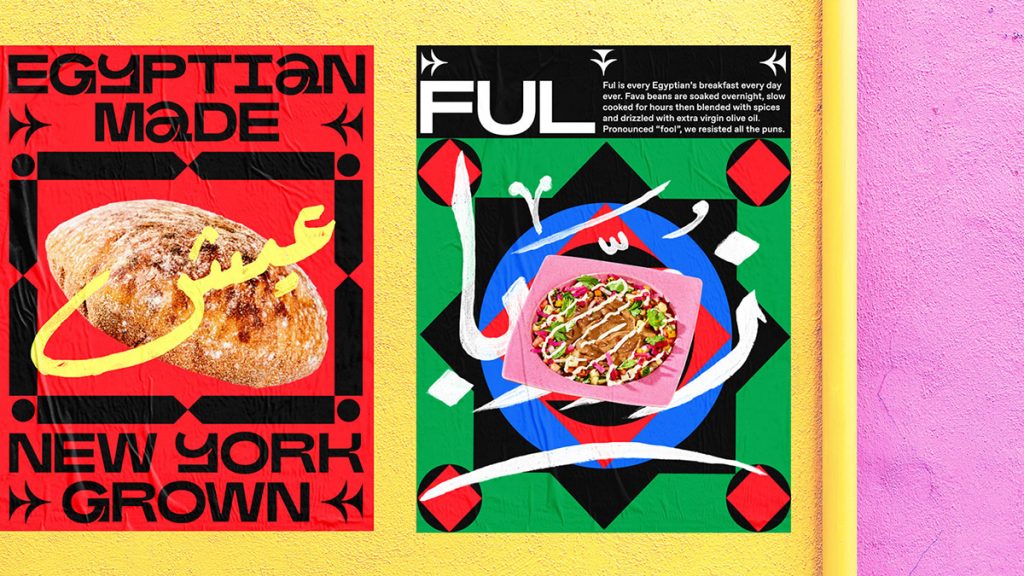
Color, image-making, branding, campaign thinking, and highly controlled visual worlds.

Systematic typography, cultural work, and an uncompromising modernist visual language.
Contemporary visual identities with strong typography, motion, and cultural positioning.

Graphic systems that move, mutate, and extend across digital and physical environments.
A foundational Swiss sans with more personality and history than generic Helvetica use.
A broad, flexible family that bridges American grotesks and European neo-grotesks.
Clean, flexible, contemporary typography with strong editorial and brand utility.
Compact, sharp, modern type with enough character to avoid feeling generic.
High-impact display typography built for scale, compression, and commanding headlines.
Elegant, soft, editorial serif that works especially well against harder sans-serif systems.
A foundry worth following for historically informed, contemporary type design.
Contemporary type design with strong cultural relevance and experimental flexibility.
One of the core references for understanding modular organization and disciplined page structure.
Practical, intelligent typography guidance that remains useful across print and digital work.
A visual thinking book about observation, ideas, perception, and creative connections.
Essential for understanding how color perception changes based on context.
A practical book about the business realities of professional design.
Long-form conversations with designers, artists, writers, and creative thinkers.
Design, architecture, infrastructure, and the invisible systems shaping daily life.
A benchmark for brand voice, conceptual advertising, cultural relevance, and restraint.
Concept-first campaigns with strong cultural positioning and broad media thinking.
Essential reference for modern advertising thinking and the creative revolution.
A campaign gets stronger when every execution clearly belongs to one central idea.
A visual should not be forced to explain what a weak headline fails to communicate.
Strong campaigns create multiple executions without becoming repetitive or visually random.
Usually 0.125 inch in U.S. commercial printing. Confirm with the printer before final output.
Use intentionally for large black areas. Avoid using it blindly for small black typography.
Generally use 100K only for small black type to avoid registration problems.
Typically 300 ppi at final reproduction size for high-quality commercial print.
Always verify overprint settings, especially black objects and imported PDF artwork.
Keep structural lines, folds, glue areas, and production annotations organized and clearly separated.
A high-gloss finish applied selectively for contrast, emphasis, and tactile hierarchy.
Image compositing, retouching, generative workflows, mockups, and raster production.
Vector systems, identity, iconography, illustration, and production artwork.
Editorial layout, print systems, long-form documents, packaging support, and production.
Interface design, systems, prototyping, components, and collaborative visual development.
Useful for ideation, iteration, organization, coding support, copy development, and research.
Strong for exploratory visual direction, art-direction studies, and image generation.
Useful inside Adobe workflows for generative fill, image extension, and concept iteration.
Fast, content-friendly web framework well suited to design systems, libraries, and portfolios.
Deployment, DNS, edge infrastructure, Workers, and fast delivery for modern web projects.
Grid, hierarchy, clarity, asymmetry, and typography used as structure rather than decoration.
Form, function, geometry, reduction, material thinking, and cross-disciplinary design.
Dynamic geometry, strong diagonals, political graphics, photomontage, and visual urgency.
A reaction against rigid modernist rules through irony, layering, quotation, and expressive form.
Raw structure, visible systems, strong typography, and deliberately exposed digital construction.
Limited inks, visible texture, overprint, misregistration, and production imperfections used expressively.
Intentional friction, awkwardness, disruption, and rule-breaking used as communication rather than decoration.
Readability should not be sacrificed just to make a layout look expensive.
Random borders, giant Arial, and deliberate ugliness do not automatically create a concept.
Color effects cannot substitute for hierarchy, structure, or a real visual idea.
Floating glass, hyper-detailed lighting, shiny particles, and meaningless cinematic haze are becoming generic.
Not every idea needs ten slides. Sometimes one image and one sentence are stronger.
If twelve paragraphs are required to prove the idea exists, the idea may not be doing enough work.
Use AI to expand iteration,not replace judgment.
Design references are only useful if they sharpen judgment. Sometimes knowing what to stop doing matters just as much as knowing what to study.
Readability should not be sacrificed just to make a layout look expensive.
Random borders, giant Arial, and deliberate ugliness do not automatically create a concept.
Color effects cannot substitute for hierarchy, structure, or a real visual idea.
Floating glass, hyper-detailed lighting, shiny particles, and meaningless cinematic haze are becoming generic.
Not every idea needs ten slides. Sometimes one image and one sentence are stronger.
If twelve paragraphs are required to prove the idea exists, the idea may not be doing enough work.